Wednesday 27 November 2013

3D:Prototype for final body armor

This a sample piece i made.
I was inspired by tradition British viking and roman armor. initially i wanted to make the armor discrete so it could fit underneath clothing but i though it would be more effective as a defense mechanism because it would prevent an attack.

I decided not to go with this sample because i didn't think it looked as threatening or strong as it could of looked.

3D:Hedgehog body armor design

I am going to make a defense mechanism using spikes.
When the person wearing is in any type of situation where they are  confronted with violence spikes will automatically spring up as a warning, much like a hedgehog.

the armor will be fitted with a galvanic skin response meter that will be able to detect fear and distress from the rise in the levels of sweat on someones skin, this will be connected to the spikes.

I want to look at different types of armor.

3D: Work with tooth picks


Final outcomes


3D


Designs inspired by virginian tiger moth catepillar. Sketches of hand growth.

3D designs for prosthetic hand piece


Tuesday 22 October 2013

Graphics pathway: final poster.

This is my final poster of an exhibition to be shown in 2033. I wanted my exhibition to be about science fiction so i wanted my poster to be very futuristic and space themed. I think my poster turned out very retro sci fi i used bright colours in my poster because i think it reflects my personality and i was inspired by 80's space games therefore i used lots of triangles with lasers shooting out of them. This poster is effective because of its colours its very eye catching however i don't think it is too clear what it is trying to communicate apart from the digital typography its not very space themed. i think the poster should have been simpler perhaps only using sci fi typography. overall i did enjoy the task but my poster could have been better.


Graphics Pathway

collage of faces. i enjoyed this exercise because i enjoy making collages. I like the mix of black and white and colour because i think it makes it stand out but i think it would have looked more effective if i had used only black and white because i think it would have blended in better and looked more realistic.


Graphics pathway

 for this drawing we drew a self portrait of our self without taking the pen or pencil off the page. i enjoyed this exercise i focused on trying to put all the features on the face in the right places without using too many lines overall i think it looks quite good.
in this one we could not draw with the hand we normally draw with i used my left hand. i struggled with this one i didnt turn out anything like the person i was drawing. In this one i focused on the lines in the face.


 in this one we could only draw with our mouth. I didnt enjoy this drawing i found it very difficult i attempted to put on all the features

I like this drawing the best. We had to stare at a person and then draw from memory with our eyes shut. I this one i was forced to focus on remembering features on the face and also the postioning of the features i think it worked out well considering.


graphics pathway

In this exercise we drew an ear i enjoyed this exercise because you noticed things about the ear you may not have noticed the ear is not as simple as it seems it is quite complicated when drawing. next time i would like to have used other materials such as charcoal as i just used pencil in future i think i should use a variety of materials thats something i struggled with. I like drawing and i enjoyed the fine art side of the graphics pathway.


Sunday 6 October 2013

3D design: Cardboard Bridge (Group Work)

For this exercise we worked in groups to build a bridge made from cardboard and bamboo sticks that could support a remote control car. Our bridge was structurally unconventional but worked and i think it looks very interesting. However i think we could have put more time in on working on the road because we rushed it towards the end. I enjoyed this task although it was sometimes difficult as it required alot of communication which was very time consuming.


3D Pathway

I made a case to protect my spaghetti structure from the weight of a basket ball only using an A3 sheet of paper ans two A4 papers. I didn't enjoy this exercise because i knew it would be unlikely that my case could stop my spaghetti structure from being crushed. However i did like the shape of the case, it looked very architectural.


3D design: Spagetti structures

we made structures using spaghetti to support three plastic balls. My sculpture supported the three balls relying completely on balance which i think had worked well but i should have used more spaghetti to make it more sturdy.


Although this sculpture was not too sturdy and quite flimsy when i put some light on it, it produced some really interesting shadows.


3d Pathway: seat made from cardboard


 For this exercise we had to make a chair to support the weight of a person that could also be flat packed. i was disappointed with my outcome as it went unfinished i need to improve on managing my time better the structure had potential to be a chair but there was not another pieces to make it more study. i did enjoy this exercise but i need to work faster in future.


3d Pathway: Waterbottle holder made from paper

i was very pleased it managed to support a water bottle and the water holder was very sturdy i was abit skeptical at first however it worked. I could have improved on the design on the holder to make it more appealing.

Saturday 28 September 2013

Tate Modern Review

The name of the exhibition I visited was the Transformed Vision exhibition held at the Tate Modern. There were many artists such as Thomas Hirscharn, Germaine Richier, Allan sekula, Mark Rothko, Miyako Ishiuchi and Gerald richler. I Observed this exhibition was very war orientated and as the exhibition progressed it told a story. My immediate reaction was that from the beginning the pieces were very bold and created a very gloomy and dark atmosphere which conveyed very deep emotion and it felt to me like depression. Emotion as to be expected made frequent appearances throughout although a piece that undoubtedly caught my eye was a piece by Thomas Hirscharn found at the entrance of the exhibition I found this sculpture very captivating as it was made from everyday materials but looked like deformed figures which made me feel quite emotional. There are connections between he work in this exhibition and my work. This exhibition shocks and provokes a public reaction through some of its horrific imagery and I enjoy making work to enhance a public reaction and I future I hope to create more emotive work. Overall I don't think this exhibition requires a open mind as it draws in the sympathy of the audience.


Tuesday 24 September 2013

Work on photoshop


Fashion Photography

I wanted to make a floral headpiece inspired by my samples. I enjoy working with collage therefore for this exercise i cut out red back grounds from magazines and newspapers and made a collage which i then used to make the shape of the rose. Although it was time consuming i think it looks very effective and the cut outs from magazine made the rose look very shiny. My biggest challenge was getting the rose to stay on the head  without falling off, so i added a band made out of paper i have folded repeatedly and stapled the rose to it which made the head piece very sturdy. I am happy with my out come i think it looks very well made.


Work on Manequin (Fashion Pathway)

 In this exercise we were in groups and we made larger versions of our easiest to construct samples and combined it with other members of our group samples. I enjoyed this exercise because I liked working with other samples and communicating with the group on what looked good. However I didn't enjoy creating compositions alongside themes as it was hard to convey certain things for example romantic as everyone has there own interpretations on what romantic is.


Fashion Pathway

Samples for design
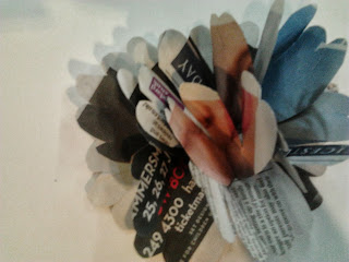
I used a combination of different types of paper to create floral samples from news paper to tissue paper. I liked this exercise I think the samples turned out very well and have a resemblance to types of flowers. For me the Poppy sample I made with the red tissue paper turned out the best due to its simplicity made it look very graceful like a real flower also out of all of the samples the red makes it stand out.